Fail.
Dang. Have you ever had one of those days where you took 516515681x pictures and non of them turned out right? Yeah. That's me. For the first time ever. I don't why know. And the worst part was that this manicure did not turn out to be what I had in my mind. But tell me what you think.

Look my ring finger. My husband said it looks like white blobs. It's suppose to say D & B, you know, like the initials for the brand. But this was a horrible attempt. Unfortunately. I don't think everyones manis always turns out the way you want it to and/or imagined but you embrace it and continue to practice because practice makes perfect!

My failed attempt.
What do you think?
Anna
PS Happy Friday! Have a great weekend everyone!
Dang. Have you ever had one of those days where you took 516515681x pictures and non of them turned out right? Yeah. That's me. For the first time ever. I don't why know. And the worst part was that this manicure did not turn out to be what I had in my mind. But tell me what you think.
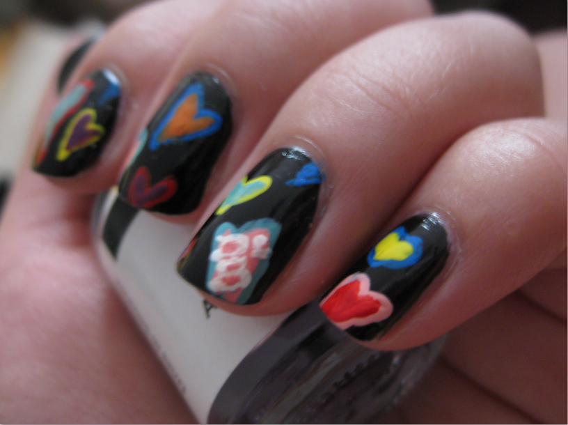
Look my ring finger. My husband said it looks like white blobs. It's suppose to say D & B, you know, like the initials for the brand. But this was a horrible attempt. Unfortunately. I don't think everyones manis always turns out the way you want it to and/or imagined but you embrace it and continue to practice because practice makes perfect!
However, it turned out to be a failure. I don't like it at all. Below is my inspiration for this mani.
My failed attempt.
What do you think?
Anna
PS Happy Friday! Have a great weekend everyone!


story of my life about the pictures!! but this is really cute!
ReplyDeleteIm not the only one. I feel a little better! LOL But thanks! (=
DeleteI think you are being to hard on yourself! I can see the DB and I think it is a really good representation of the design! :)
ReplyDeleteThank you Katee!
DeleteThis is so pretty!! You did a wonderful job! :D
ReplyDeleteThanks! Im beginning to feel a little bit better!
DeleteAwww I think this is super cute! I love the colors of the hearts and I can totally make out the D&B!
ReplyDeleteThank you!
DeleteI really like the two toned hearts! It only looks bad-ish to you because you have an image in your mind of how you expected it to be. We don't have that mental image so to us this looks pretty great.
ReplyDeleteThank you so much! (=
DeleteOhh I don't think this is a failure, I like it! And I have had "bad picture days," sometimes it just happens that way!
ReplyDeleteI really like them! & I see the initials! Sucks that you had a bad photo day, bad photo days totally suck.
ReplyDelete